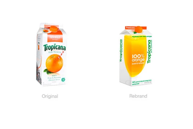
Butchering a Brand

Butchering a Brand
3 minutes read. October 31st, 2018.

Tropicana

In 2009, Tropicana’s packaging rebrand backfired in such horrifying fashion that sales dropped by 20%. Within two months of the visual overhaul, Tropicana announced that they would revert to the original design.

One of the key reasons for such an alarming drop in sales? Customer confusion. Consumers lost track of the reference elements used to identify the product – most notably the original logo (with its tagline ‘Pure Premium’) and the visual element of the orange with the straw. To the consumer, without the classic Tropicana hallmarks, the packaging was assumed by many to be that of a low-range supermarket brand.

Lesson #1 – Whilst not always the case, rebrands in which too many elements are changed always run the risk of losing brand recognition. The consumer’s emotional connection to elements of a brand or product should never be taken for granted.

Tropicana rebrand

Consignia

Consignia, the Post Office’s attempt to consolidate all arms of Royal Mail’s business under one umbrella brand, lasted just 15 months. The aim was to attract a more corporate customer base, as well as to promote the company’s expanding services.

After an initial cost of around £2million, the company reverted to Royal Mail, leaving them a further £1million out of pocket.

In opting for a bland name which carried little meaning to audiences, as well as an entirely new colour palette and visual identity, the company eroded the tradition and brand values held by Royal Mail for the past 500 years.

Lesson #2 – Rebranding to encapsulate multiple business arms and services can be a perilous task, even more so for businesses who opt for an entirely new name. When renaming as part of a rebrand, a name befitting of the tradition and heritage of its predecessor requires careful consideration. Combining this with a colour change resulted in both erosion of the company’s identity and a loss of the brand’s tone.

Royal Mail Consignia rebrand

Leeds United

Arguably the biggest rebrand horror show of 2018, Leeds United’s club badge redesign was one to forget – within 24 hours of launching, the outcome was scrapped entirely. Taking more than six months’ work to complete, Leeds’ new badge was extremely successful in uniting the fanbase – but not for a good reason. The new design was wholeheartedly ridiculed, a sentiment backed by a petition which acquired almost 100,000 signatures within 12 hours.

Where the process failed is a no-brainer – the consultation process. The club surveyed 10,000 fans ahead of its 2019 centenary year, asking fans what Leeds United meant to them – note how this is not remotely the same as asking specifically what supporters might wish to see on a club badge.

Lesson #3 – Specific, meaningful consultation and involvement with target audience is a vital part of a rebrand. The creation of a memorable and iconic logo must be based on a clear understanding of audience opinion. Definitive market research must be carried out, with no questions whatsoever left open to interpretation.

Leeds United rebrand

Spread the word, share the love, pass it on. If you like this article, feel free to share using the handy link below.

Wanna get in touch?

Butchering a Brand

Paul Hough

Creative Director

Get in touch with me