RBSL Brand Identity
Maintaining focus on branding projects is tough. But imagine juggling two separate groups who want to turn two brands into one? Well that's exactly what happened when Rheinmetall joined forces with BAE Systems Land.

Double up
The aim of any brand is simple: maximum impact, minimal confusion. But with a merger, you have to maintain links to the core of each brand, while also creating a brand with a DNA of its own. Not the sort of thing that happens overnight.

The brand
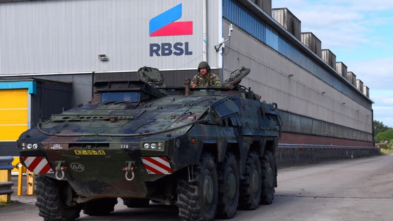
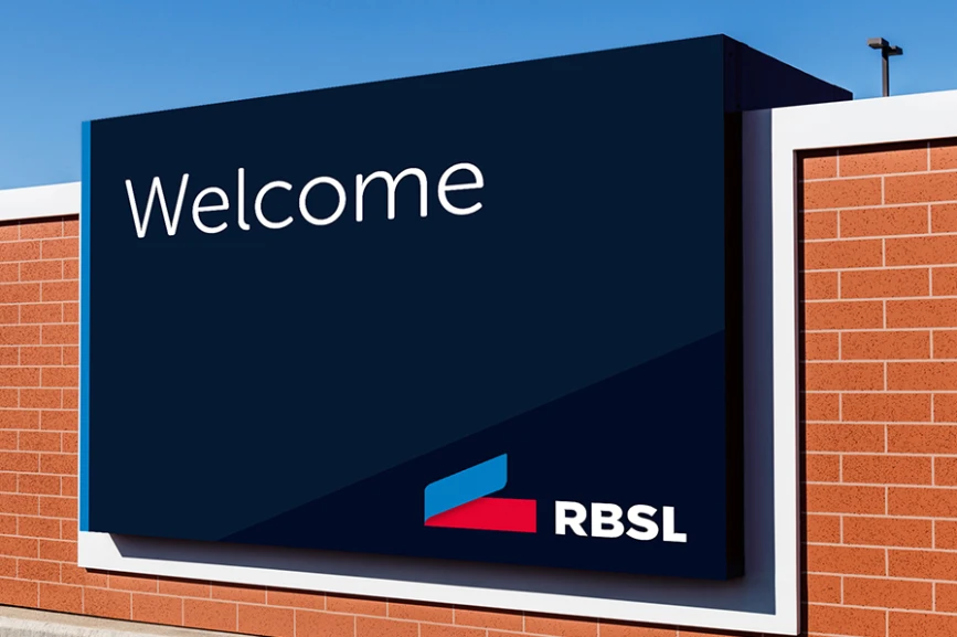
Successful brands work when they unite from the top down behind a core mission. That's why we created a unified visual language and colour palette to represent how RBSL saw themselves. The blue ribbon from Rheinmetall sits alongside the red block from BAE systems, with an all new word mark underneath.
The biggest challenge?
Normally, branding takes time - and we always recommend going through the full process to get it right. But rules are there to be broken. In other words - we had to deliver, quickly this time. Not only did we manage to get the brand right, but we also had it ready for the big reveal. From on-site signage to entrance displays, from web interfaces to social media graphics – the new brand was ready to go.
The results
RBSL represents a unity of mindsets and cultures. And they looked to us to ensure that every little detail was ready for the big launch. We took them on a journey of brand definition, and offered creative support every step of the way.
Spread the word, share the love, pass it on. If you like this article, feel free to share using the handy link below.
Wanna get in touch?

