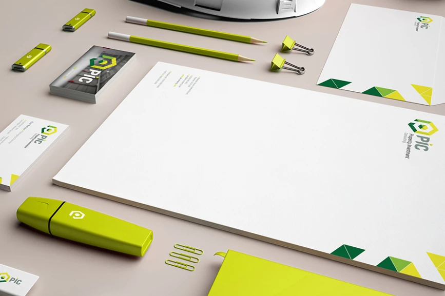

PIC Branding & Website

PIC aren't your traditional investment company. And when you're not traditional, you don't want your brand to be traditional either. They came to us to find a brand that would a help them stand out and show off their values. The wordmark and structured graphic uses a geometric triangular grid to reinforce strength and reliability. The angled elements within the mark are a little nod to the idea of forward thinking.

We followed the brand up with creative stationery and a fully responsive website, which showed off PIC's forward thinking, strong and reliable credentials. A forward thinking, strong and reliable investment company? Sounds like a safe bet to us.
Spread the word, share the love, pass it on. If you like this article, feel free to share using the handy link below.
Wanna get in touch?

