Inspired Energy Brand Identity
Inspired Energy are a brand on a mission. In double quick time, they became an established, respected organisation at the top of their game. That success was in large part down to the amount of emphasis they put on their brand at their heart of their success.

Re-inspired?
But even the best brands know they need a subtle boost now and then. Not a complete reinvention, but a few well placed design tweaks to modernise what's already working incredibly well. And they turned to us at Think!Creative to help them do just that.
The Challenge
We needed to stay true to the solid base that Inspired already had, without losing what made them great. And while we ended up evolving the brand, we did this by truly exploring the territory of the brand.

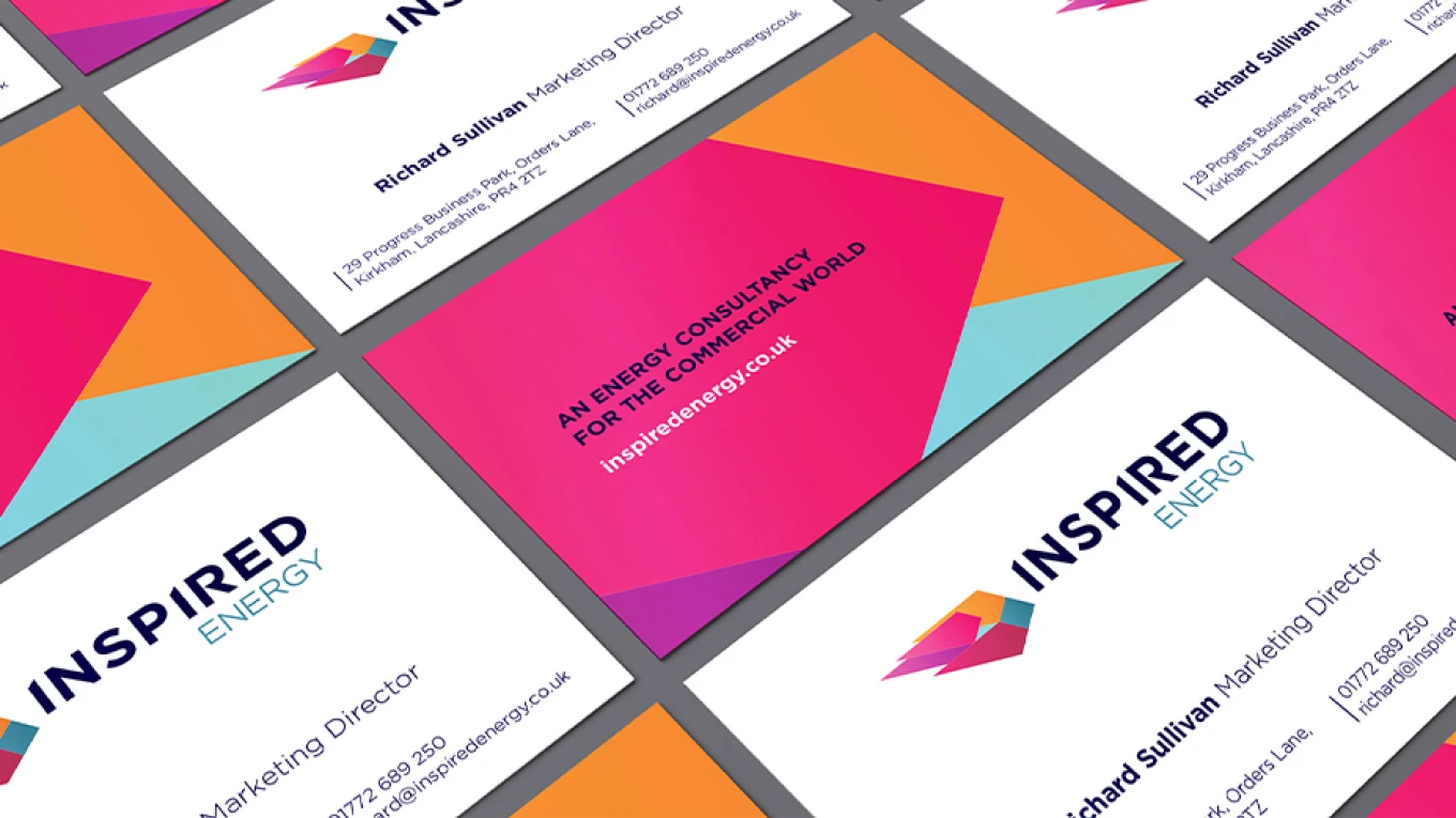
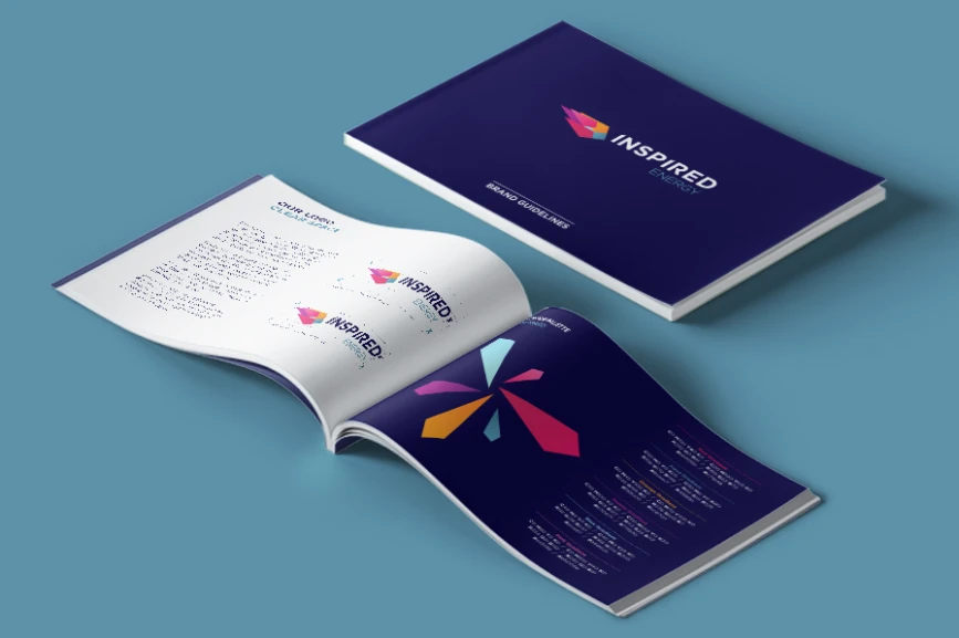
The Inspired Energy logo combines a vibrant colour palette with dynamic, angular shapes to appear as-if-in-motion. We simplified and modernised those elements, so they worked better across different touch points and media types, as well as at different sizes.
Spread the word, share the love, pass it on. If you like this article, feel free to share using the handy link below.
Wanna get in touch?

