
Glover's Swim School
When it comes to the competitive world of branding, it’s often a case of sink or swim. For Glover’s, we set out to ensure it was the latter.

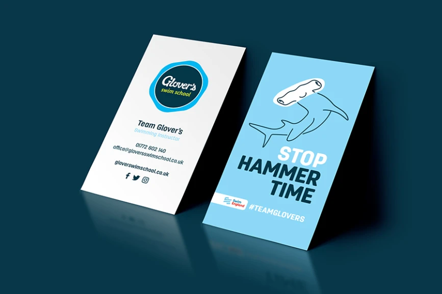
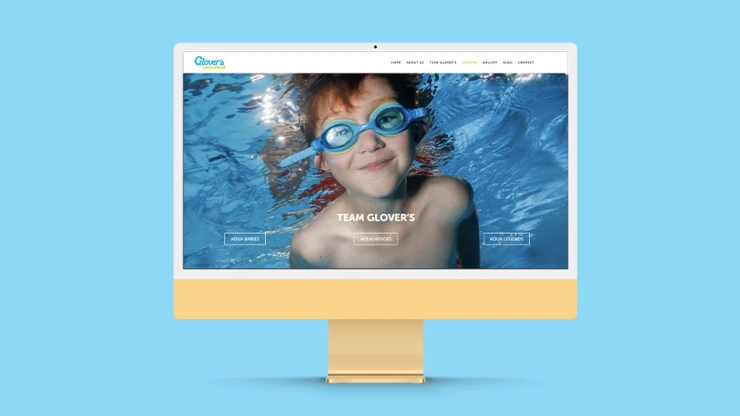
The Preston-based swim school approached us to freshen-up their brand identity. From logo updates to the introduction of doodle illustrations and a light-hearted, inspirational tone of voice, we offered both print and digital creative to give Glover’s with the branding boost they needed. Cleaner, simpler, warmer and fresh.


Spread the word, share the love, pass it on. If you like this article, feel free to share using the handy link below.
Wanna get in touch?

