Wanna get in touch?


People get itchy at the idea of surveillance. But almost by accident, Parking Eye had created the wrong impression with its old brand. With strong black and yellow colours, angular chevron graphics and strong messaging, they looked and sounded way too authoritarian.

But that isn't who Parking Eye are. So we helped them come up with a brand to support their strategic ambitions for the long term. Their goal? To help land owners take control of parking on their sites and to reduce costs with smart technology.

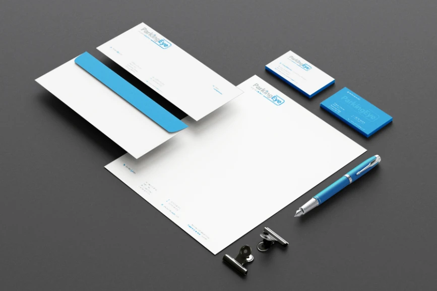
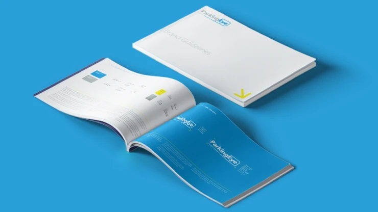
To help get that message across - we gave the brand a lighter touch. Through a fresh colour palette, a softer typeface and a new tone of voice, Parking Eye started to show how they oversee rather than enforce. And you know what? It worked. The transformation of ParkingEye’s brand has been a huge success, which just goes to show the importance of brand perception.
Spread the word, share the love, pass it on. If you like this article, feel free to share using the handy link below.

