Wanna get in touch?


There’s nothing we like more than when a business moves into a brand-spanking new office. OK we'll level with you. There is something we like more. We really like it when they ask us to add a splash of branding to their freshly painted walls.

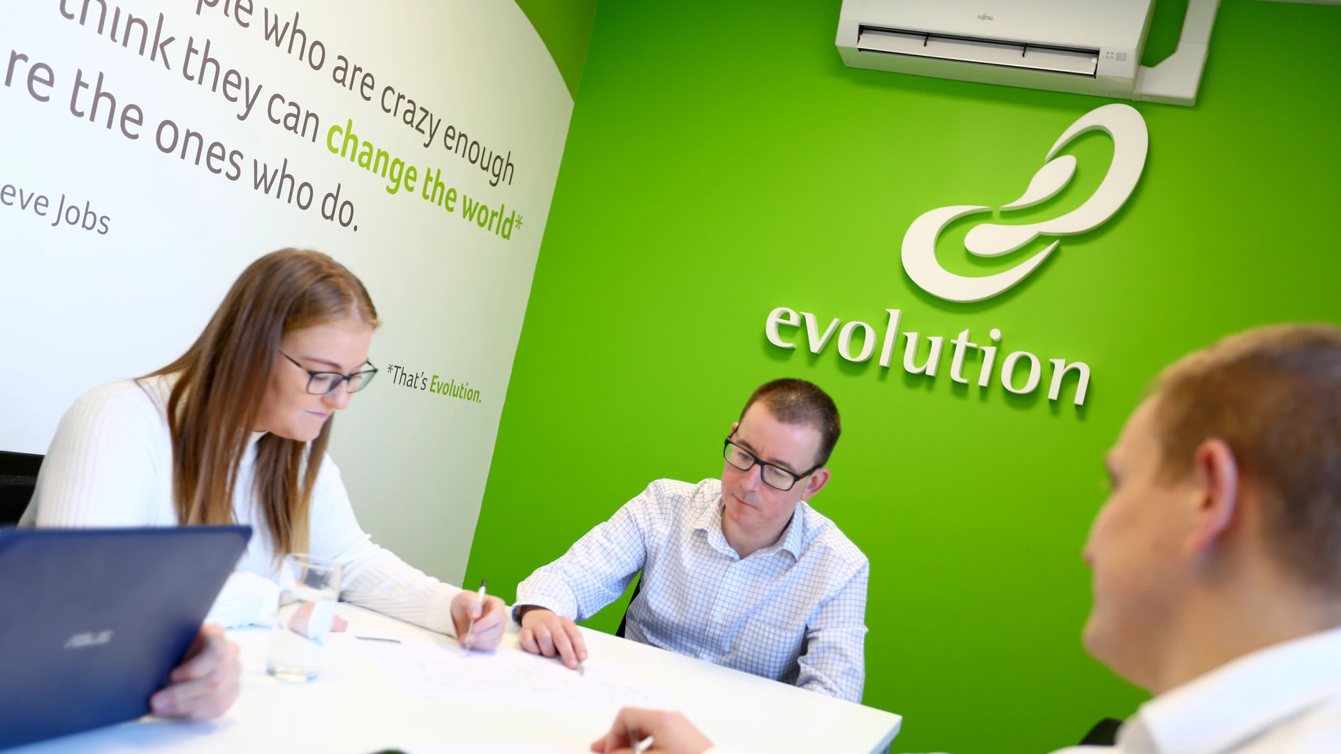
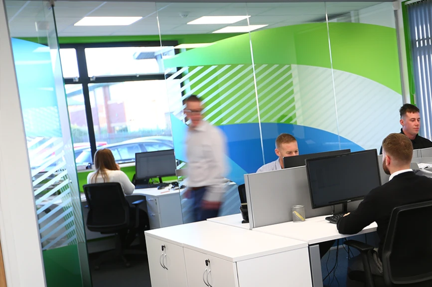
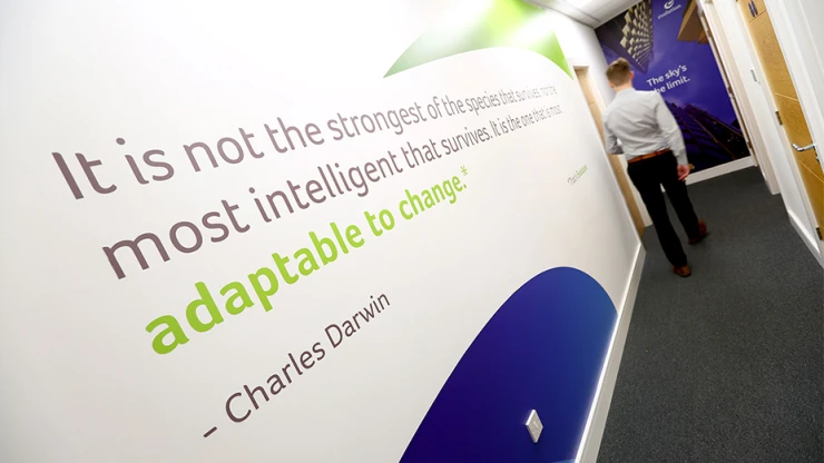
For long-term client Evolution, we made the most of their sweeping blue and green logo elements, which we felt really showed off the versatility of the brand. We created glass manifestations, entrance signage, interior wall graphics and a meeting room table-top design, with each design based around the concept of development, progression and moving forward. After all - that's Evolution.
Spread the word, share the love, pass it on. If you like this article, feel free to share using the handy link below.

